
The Best Way To Mobile Optimize Your Site 2016
Hey Whats Up Guys! We know that the concept of searching for content online using mobile devices is steadily on the rise, primarily due to the vast plethora of mobile devices and tablets now readily available in the market. They really seem to be advancing the cause, and more and more people are buying and using them. So how are these evolving trends changing things, and how does it effect you as a website owner? So Today I gonna going to show you the best way to Mobile Optimize your site.

Let Start it below:
The Best Way To Mobile Optimize Your Site
Following are the 3 best ways to Mobile Optimize your site:
1.Using Responsive Design in site:
Probably the most popular mobile optimization technique used today. Responsive Web Design involves designing content that automatically resizes and rearranges itself to fit the screen size and resolution of any mobile device. Since the content itself is redirecting, there's no need to create custom redirects to other mobile pages, or changing the on-page content itself.

For the user, this means a smooth user journey, and for a content manager, it means content only needs to be updated once. From a developer viewpoint, RWD may require rebuilding your site framework with flexible templates, grids, style sheets and JavaScript but with very rewarding results. Personally, this is my favourite mobile optimization technique, and one of the easiest there is.So by using the best web design you can make your site web optimize.
I will recommend you to see this article to buy good web designs: Best websites to buy scripts and themes.
I will recommend you to see this article to buy good web designs: Best websites to buy scripts and themes.
2. Separate Mobile Site:

The final implementation you might want to consider is creating a separate mobile site, where smartphone users will be directed to a mobile-optimized version of your site. This implementation allows you fully customise your content for a mobile audience, since it’s often an independently hosted solution. Similar to creating dynamic serving content, this means you need to make separate updates for content or styling pieces to ensure a smooth user experience.
Facebook is a perfect example of this solution. You have Facebook desktop version, and then you have Facebook mobile version. If Facebook had just used RWD to deliver mobile content, then low-end devices would have a lot of trouble keeping up with all the Facebook features such as Apps, Games, Chat, Instant notifications, and more. But with dynamic content serving and separate mobile site, Facebook has made sure that mobile users don't access features not suited/compatible for them.So I sure that this help you very much.
3.By Dynamic Content Serving:
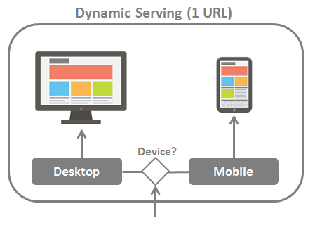
This technique is somewhat similar to RWD, but very different at the same time. While RWD detects screen size and resizes the content, dynamic content serving detects the user-agent at the server-end, and then presents a custom page on the same URL. The custom page is dynamically generated.
Although this technique is hard to implement and requires a lot more maintenance, it is the most powerful method for serving mobile content to users, and experts recommend it for experienced webmasters.So try that and get some thing from it.
So friends these are the best 3 ways to mobile Optimize your site in 2016.Enjoy it!!!!!
I hope that after reading this article you can easily know Best Way To Mobile Optimize Your Site.If you like this article share it on social media to help other blogger brothers.
Let me know you if you have any problem regarding to this article.If you have any problem you can comment me in comment box.Thanks for reading this article.Stay tuned for more articles.
Let me know you if you have any problem regarding to this article.If you have any problem you can comment me in comment box.Thanks for reading this article.Stay tuned for more articles.


No comments: